Creating Dynamic Reports in the Cloud
The cloud can generate dynamic reports in the cloud off of data manually uploaded or updated automatically with wireless devices. For paying users, these can be completely customized with Python code natively run in the cloud to allow for custom analysis approaches and modified plot types, themes, colors etc.
In this Article
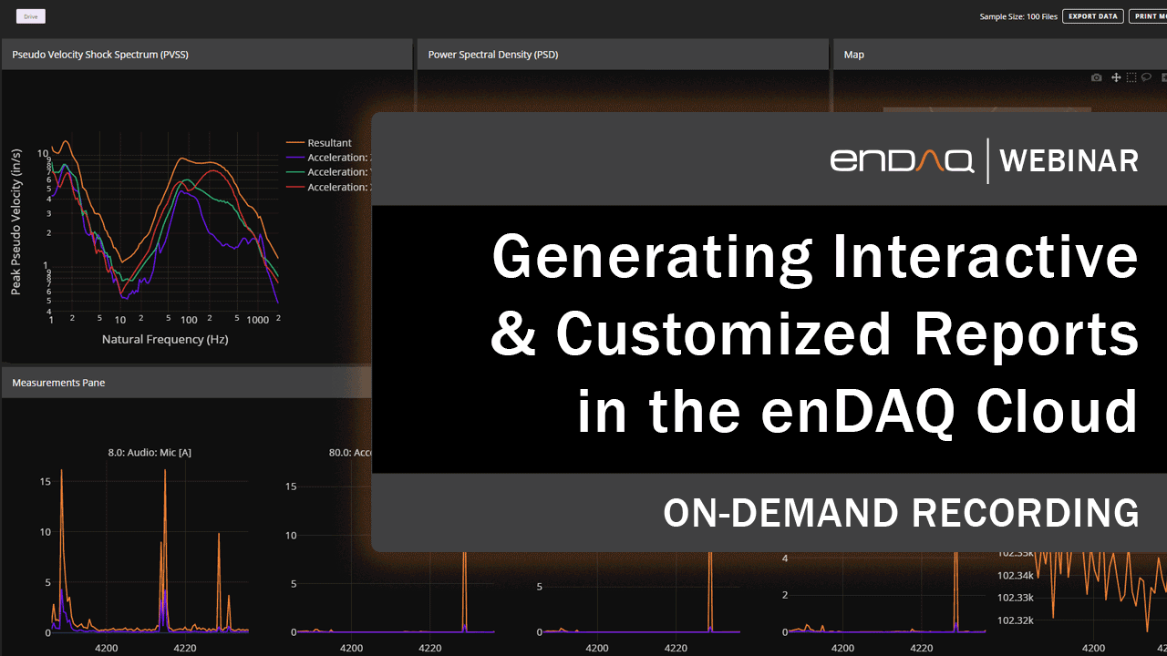
Tutorial Video
This webinar provides a detailed explanation and demonstration of the capabilities of the cloud reports, how to generate them, and some customization examples.
Click here to access the presentation PDF >>
Generating Reports
To generate a new report navigate to https://cloud.endaq.com/user/dashboard from that URL, or from the My Reports in the left-hand navigation, or the My Reports thumbnail on the bottom right when on the cloud homepage.
Then click the button New Report in the top left which will bring up this dialog box shown below.
 The user has the following inputs available to select from:
| Input Name | Description |
| Enter Title | This will appear on the top of a report once generated and describes the reports when navigating to previously generated ones. |
| Select Tags (Optional) | This filters the files to include in the report. Note that you do not need to enter a tag. Only the tags in your account will be available to select from. In the My Recordings page you can filter by tag which is recommended before generating the reports. You can input multiple tags which will be treated as an OR operator meaning any file that contains at least one of the tags will be included. |
| Max Sample Size (Number of Files) | All the files that contain the tag specified will go into the file report generation script up to the max sample size defined here. These will be sorted by the most recent upload. For example, if the input is 5 and there are 20 files that meet the tag criteria, the most recent 5 will be included in the report. |
| Choose View | If you are on a Starter or Professional tier you can use custom scripts, and select these from a drop down. |
Editing reports once generated can be completed by clicking the button in the top right, it will bring up the same dialog available when generating a new report. Also if you want to refresh the report generation with the same inputs there is a refresh button on the top of a report. This is recommended if you are using a custom script and updated that script or if you have uploaded new data since the last time the report was refreshed.

Interactivity of the Plots in the Reports
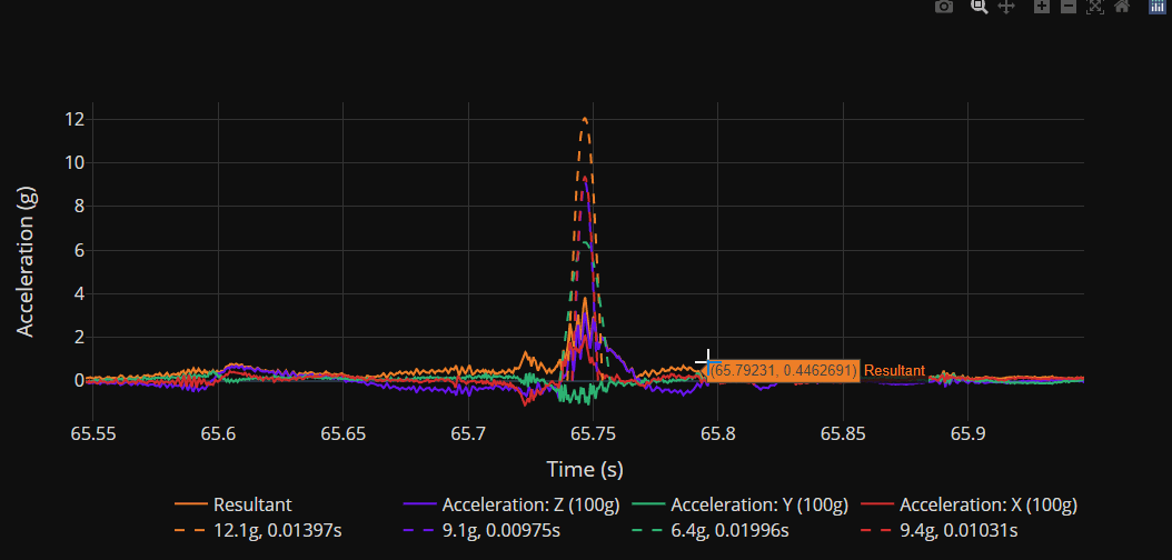
These figures in the cloud reports are Plotly Figures. These allow for a very interactive experience in the web browser where you can do the following actions demonstrated in the following GIF. Our next section will actually embed the plots here in this article where you can experience and interact with these capabilities.
- Mouse cursor hover displays nearest data points
- Zoom by clicking and dragging in the plot window - double click to zoom out
- Pan up/down or left/right by clicking either axis label
- Turn on/off a line by clicking its name in the legend
- Isolate a line by double-clicking it in the legend
- Download a PNG file of the displayed plot (note this isn't available when in the Cloud Report, but an exported HTML file would enable this)
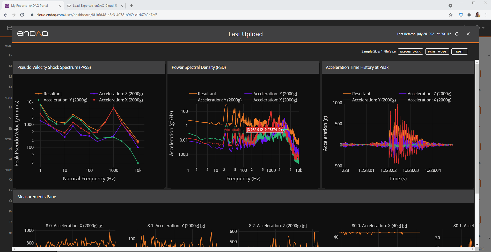
Standard Reports
For standard reports, our script dynamically selects what to present based on the inputs. The contents of the plots will change based upon how many files are being included in the report, the length of the files, and if there is GPS data. Here is a summary.
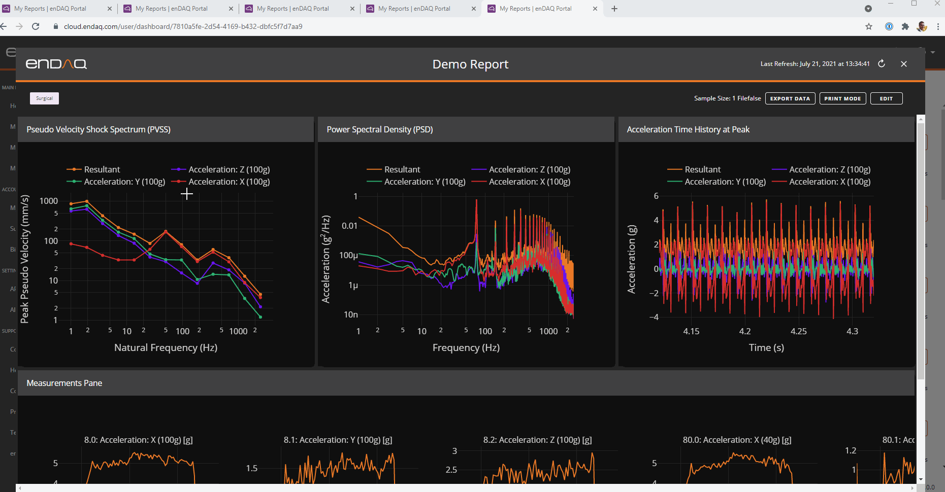
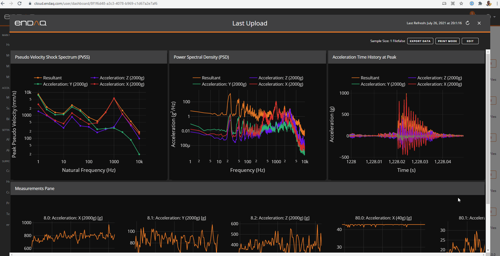
| Plot Location | Plot Type | Single File | Less Than 5 Files | 5 Files or More |
| Top Left | Pseudo Velocity Shock Response Spectrum | 3 Axes Plus Resultant | One line represents resultant value per file | Quintiles |
| Top Middle | Power Spectral Density | 3 Axes Plus Resultant
Animation of Changing PSD if Time Greater than 10 Minutes |
One line represents resultant value per file | Quintiles |
| Top Right | Time History
Map if GPS Data is Present |
3 Axes Plus Resultant
All GPS Location Color Coded by Speed |
One line represents resultant value per file
One Data Point Per File |
One line per file, no legend
One Data Point Per File |
| Bottom Row | Subplots of All Summary Metrics | Each subchannel receives its own subplot with 100 points plotted | One Data Point Per File
|
One Data Point Per File |
Standard Report Types
Dashboard
- PVSS
- PSD
- Acceleration Time History at Peak
- Measurement Pane
IDE Summary
- Meta Data
- Full Time Series
- Around Peak
- Measurement Pane
Large Time Series
- FFT Animation
- Full Time Series
- PSD Heatmap
- Event Metrics
Shock Focus
- Summary
- PVSS
- Integrated Velocity
- Full Time Series
Vibration Focus
- Summary
- FFT
- PSD
- Full Time Series
Plot Examples
PSDs
To demonstrate the difference in the plots, here are a few of the PSDs.
The first is the PSD of a file that has a recording time of less than 10 minutes.
Here is now a PSD off a longer file which is an animation showing how the frequency content changed throughout the recording.
Here is a PSD off 4 files, notice there is one line per file.
Here is a PSD generated from many files, so quantiles are defined to show the distribution of frequency content.
Time History vs Map
Here is the time history off of one file that shows the x axis as seconds into the file and displays all axes plus resultant.
Here is the time history off of several files, the x axis now is calendar time and we see one line per file.
If there is GPS data, a map like this is displayed.
Bottom Row
If there is only one file, there will be subplots for all subchannels which show the moving RMS and moving peak. For the slower sampled channels only the moving mean is plotted.
For reports with many files, the summary metrics that display in My Recordings will be displayed as scatter subplots. There will be one color per serial number if your report was generated from multiple devices.
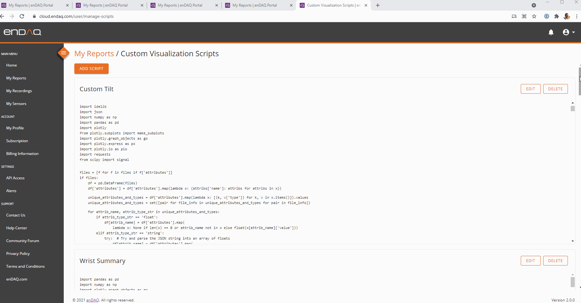
How to Customize Reports
To create or edit new custom reports navigate here: https://cloud.endaq.com/user/manage-scripts. To add a script hit the button on the upper left and to edit a script hit the edit button on the top right of that script box as shown.
There are two inputs to the report generation, and it matches exactly the response from API calls to make testing your custom report easy. This Google Colab Notebook provides some example customizations and shows the inputs and outputs of the report generation. It is recommended to try out your custom report via the API like this Notebook shows, prior to deploying in the cloud. This code can be used to see what these inputs are via the API (you will need to define your ENDAQ_CLOUD_API_KEY).
import requests

ENDAQ_API_ACCESS_URL = "https://qvthkmtukh.execute-api.us-west-2.amazonaws.com/master/api/v1/"
parameters = {
    "x-api-key": ENDAQ_CLOUD_API_KEY,
}

files = requests.get(ENDAQ_API_ACCESS_URL + "files?limit=100&attributes=all", headers=parameters).json()['data']
file_download_url = requests.get(ENDAQ_API_ACCESS_URL+"files/download/"+pd.DataFrame(files).id[0], headers=parameters).json()['url']
The files variable has all of the attribute information (time of recording, serial number, RMS acceleration, 1 Hz PSD, etc.). The file_download_url is a link to download the full file of the most recently uploaded file to give your script access to all of the raw data.
Once you have done your analysis and created Plotly Figures, you can create a JSON output variable from the script which contains the JSON descriptors of the 4 figures as shown here.
output = "["
output += ", ".join(
    [
        left_fig.to_json()[:-1] + ', "title": "' + left_title + '"}',
        mid_fig.to_json()[:-1] + ', "title": "' + mid_title + '"}',
        right_fig.to_json()[:-1] + ', "title": "' + right_title + '"}',
        measurement_pane.to_json()[:-1] + ', "title": "Measurements Pane"}',
    ]
)
output += "]"<br>
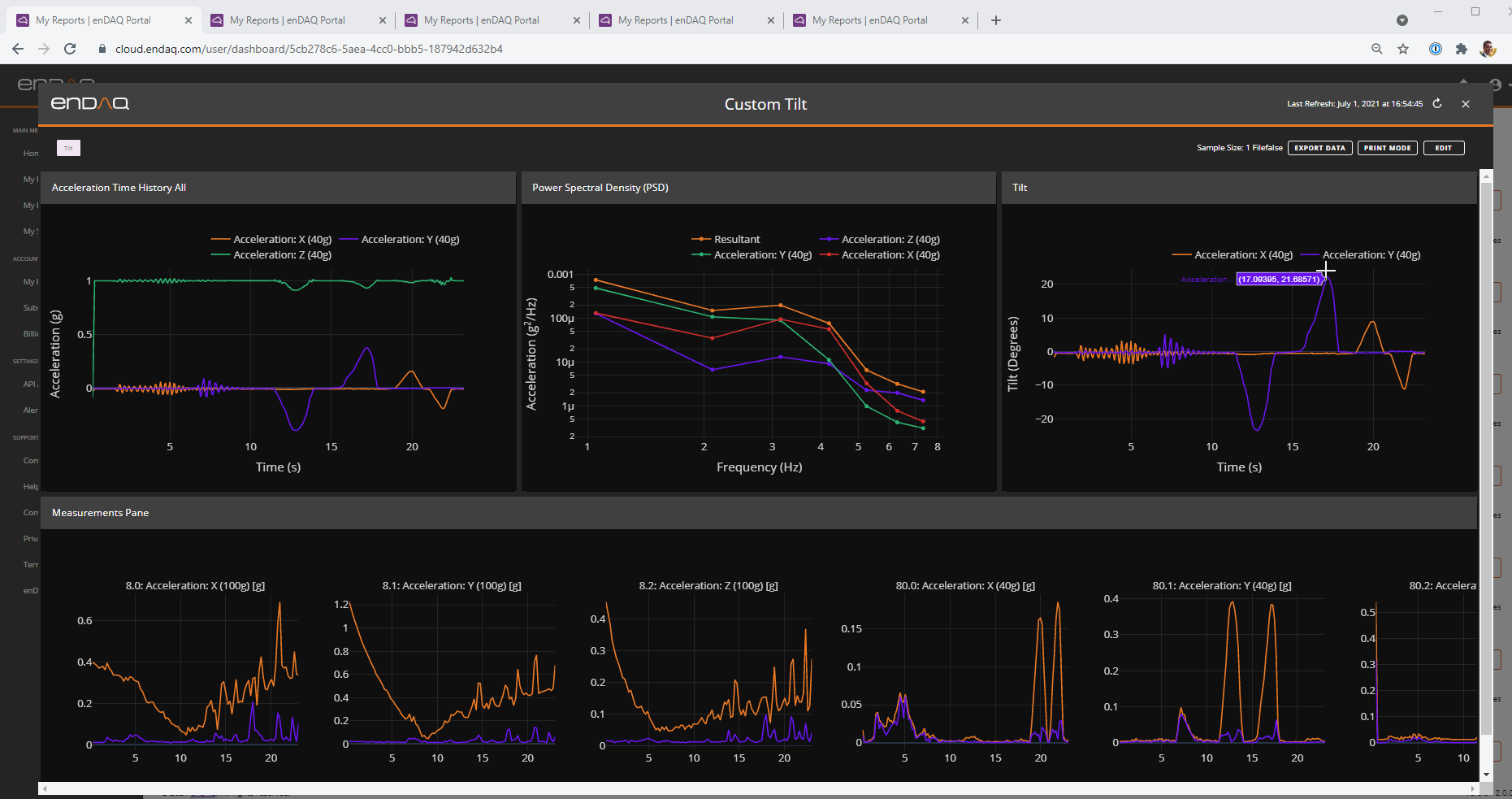
There are no limits to how to customize these reports other than the structure of 3 main figures across the top, and one wide figure on the bottom. These figures can contain any number of subplots, be of any supported Plotly figure type, and have any customized theme. Here is a GIF that shows 5 example custom reports:
- Calculating tilt from the acceleration after applying a low pass filter
- Adding subplots to the PSD and PVSS and calculating a simplified PSD and PVSS curve for defining a test standard
- Calculating the moving natural frequency of the system and plotting acceleration levels as a function of that
- Summarizing many files to define the worst case conditions but also provide the summary metric per test type (see blog: Shock & Vibration of the Wrist in Different Sports)
- Defining alarm conditions of an HVAC system after first establishing a baseline of normal operating conditions, also determine on/off time of the machine per hour (see webinar: Getting Started with Vibration Predictive Maintenance for Industry 4.0)
Exporting & Sharing Reports
There are three ways to share and export reports:
- Download/Print a PDF
- Share Log-In Details and a URL
- Exporting a JSON of the Report
Download/Print a PDF
There is a "Print Mode" when looking at a report which will change the background color to white and re-layout the plots to be in portrait mode. You can further edit the plots by clicking on lines, zooming around etc. Then click print to bring up your browsers print dialog which will allow saving as a PDF. Here is the PDF generated in this GIF.
Share Log-In Details and a URL
Each report has its own unique URL. If you share this URL with someone and also provide your log-in details, they can be brought directly into that report after passing through the sign-in page as shown. This also is helpful for bookmarking a report that you may need to reference often. In the future, we'll enable account holders to create "Viewer" users on their account so you can get this same sharing functionality without needing to also share your individual log-in.
Exporting a JSON of the Report
The same JSON object that the processing script returns and that is used by the report can be downloaded. This JSON contains all the information to reproduce these plots and extract the data as shown in the GIF below by using the code shared in this Google Colab Notebook.